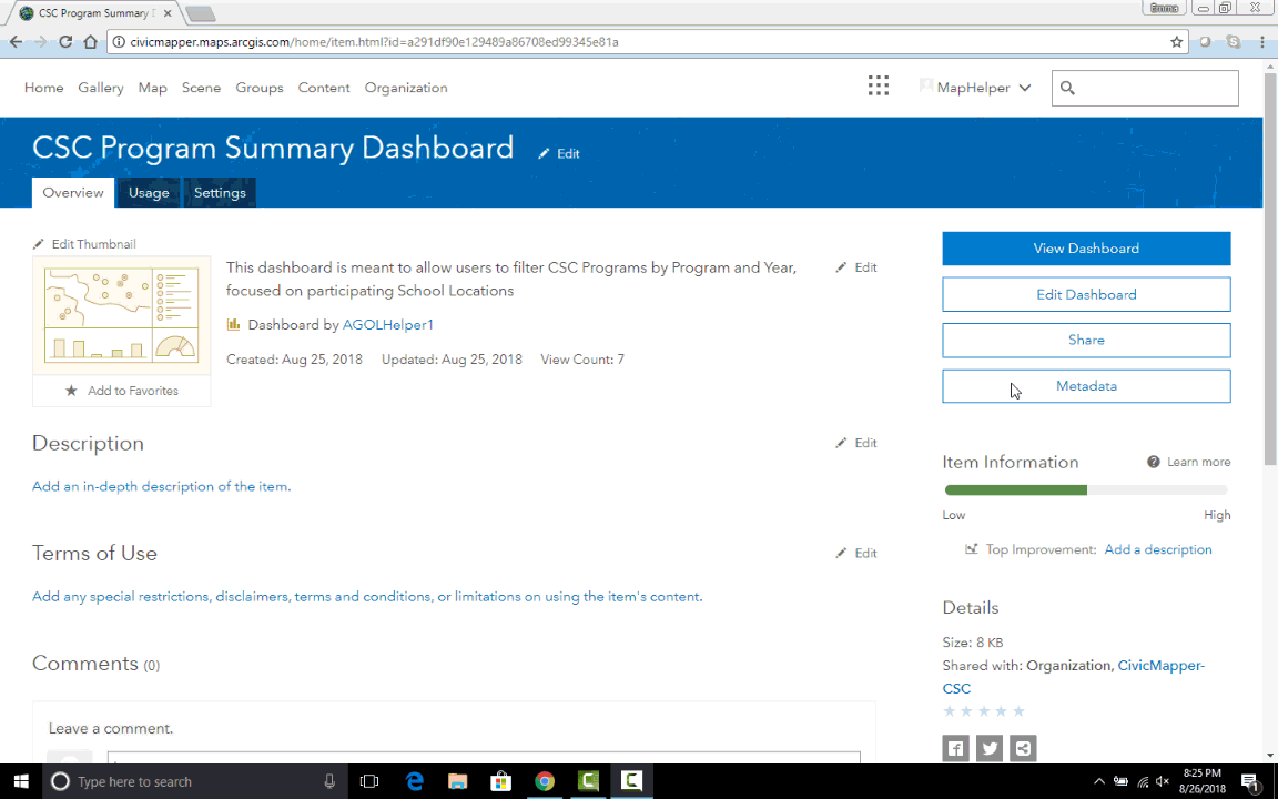
How to Use the CSC Program Summary Dashboard
The AGOL CSC Program Summary dashboard was created to show all Carnegie Science Center programs summarized by year and by program. This user document will describe how to use the dashboard functions.
See the bottom of this page for a video of an example user experience.
Dashboard Elements
The Dashboard consists of three panels:
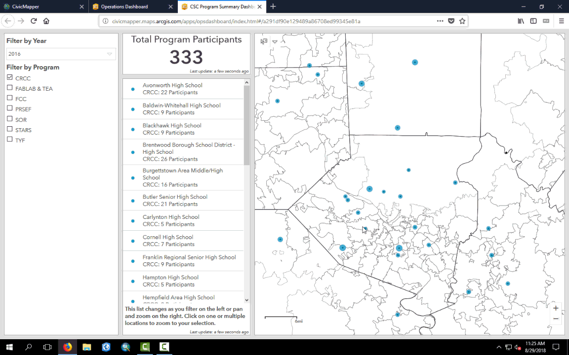
- A filter panel consisting of a year filter and a program filter
- A location list panel with total participant count on top
- A map panel
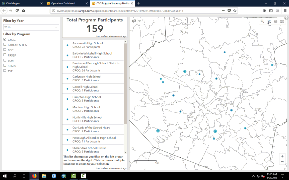
The program participant location list and participant count elements interact with the map panel so that the data shown on the left relates to the map extent (what you can see) on the right.
When you first open the dashboard, the map view is of all program participant location data. Therefore, the statistics panel is a complete summary of all programs.
Filter Panel
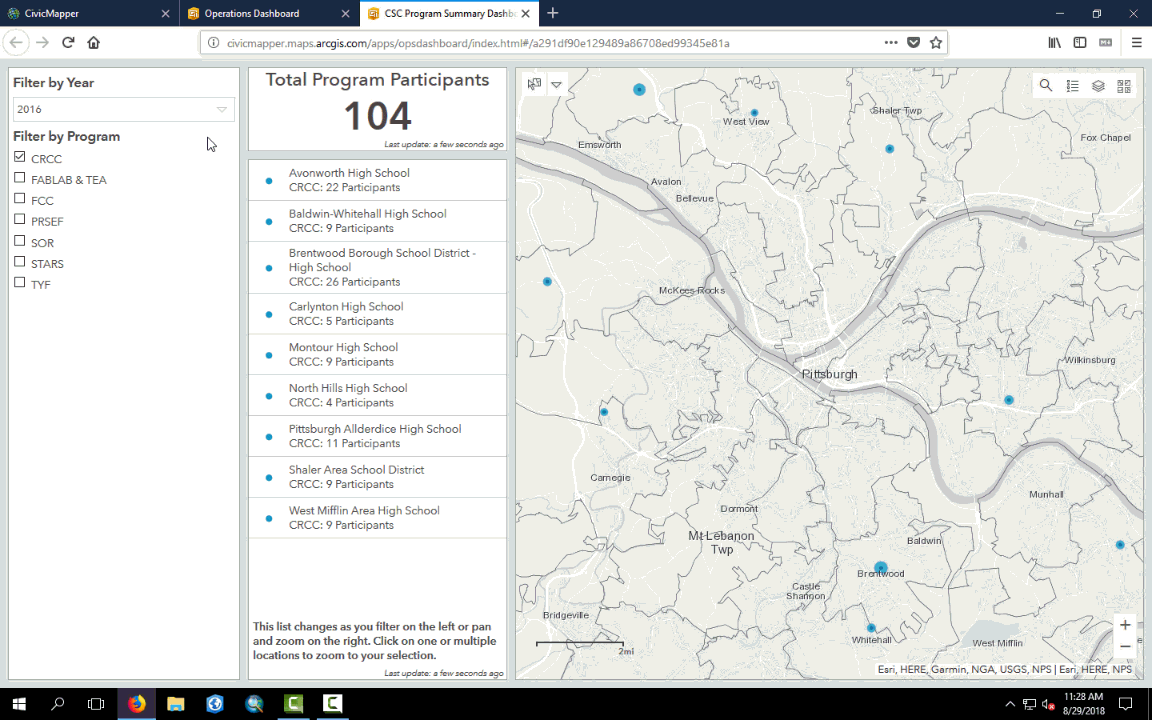
The Filter by Year drop down menu allows you to choose to display data for 2016, 2017, all years, or to display data with no year attached to it. When you make a selection, the data displayed in the map panel will be filtered to reflect your choices. The schools listed in the List Panel will also be filtered accordingly and the total partipciant count will be updated.
The user can Filter by Program by checking the appropriate boxes in the leftmost panel. When no boxes are checked, all data is displayed. When one or multiple boxes are checked only data corresponding to those programs is displayed. The map panel, the List Panel, and the Participant Count are affected by the filter choices.
Both year and program filters can be utilized simultaneously.
List Panel
Users can click on a listed school to zoom to that school’s location. Clicking multiple schools creates a zoomed view that contains all selections. The Total Program Participants will show the number of participants in the map view, not only those in the selected schools.
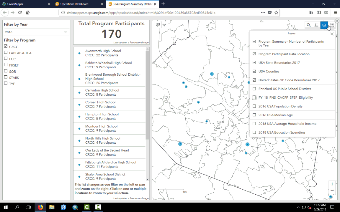
Map Panel
Geospatial data is displayed in the map panel. Widgets in the upper right hand corner of the panel allow the user to:
- search for a location,
- toggle the legend,
- toggle the Table of Contents where users can turn layers on and off,
- and choose alternative base maps.
Zoom buttons are located in the lower right hand corner, but a mouse wheel can also be used. Zoom in and out and pan the map to filter the List Panel and the total participant count.
Video Showing how to Use the Legend and Table of Contents
Video Showing how to Choose New Basemaps and Search
Video Showing how to Access Pop-Up Feature Data
Full Dashboard Use Run-Through